Educational case study / Fintech / B2С
RozetkaPay: Earning trust at first purchase
Uncovering why buyers abandon RozetkaPay express-checkout, and turning 12 interviews, a usability audit, and a competitor analysis into a clearer path to purchase.
Context
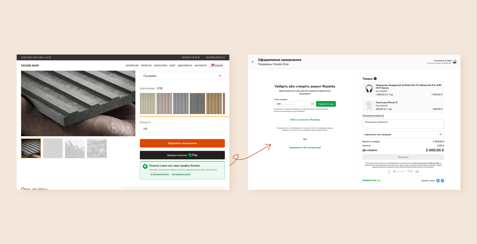
RozetkaPay is the payment service provider behind the ROZETKA marketplace ecosystem. Its “Buy with RozetkaPay” button lets shoppers check out on merchants' own websites using their existing Rozetka account, to complete a fast purchase with saved delivery and payment details.
The business metric that mattered most: how many opened checkouts actually convert into a purchase. Too many didn't, and the client's working theory was cognitive dissonance — shoppers landing on an unfamiliar site couldn't tell why they were being asked for a phone number, or what Rozetka had to do with it.
- Role
- UX Designer
- Timeline
- June – July 2026 (5 weeks)
- Skills
- Desk Research, Competitive Analysis, Affinity Mapping, JTBD, Interview Synthesis, Ideation, Wireframing
Problem
Rozetka is the #2 most trusted brand in Ukraine. RozetkaPay should have inherited that trust. Instead, it was losing it — trust broke down the moment shoppers actually hit the checkout flow.
Goal
Understand why first-time shoppers hesitate at authorization and design a lower-barrier checkout experience that feels safe and predictable.
Approach
How the problem was solved
We combined desk research, best-practice benchmarking, a competitor pattern analysis, a usability audit, in-depth interviews, and moderated usability testing to understand where trust breaks down in the checkout experience.
The research revealed that authorization was only one part of the problem. Users also struggled to understand what RozetkaPay was, faced too much information at once, and had limited control over their saved delivery data.
These findings led to three design directions: reduce the barrier to first purchase, simplify the checkout flow, and give users more control over their data.
Guest checkout was my area of ownership. Designing it well turned out to require two more decisions along the way: breaking the single dense screen into steps that reveal progressively, and rethinking how saved delivery addresses work. Here’s each decision, and the research behind it.
Guest checkout instead of mandatory phone authorization
The decision: The core problem flagged at kick-off was drop-off at the SMS OTP authorization step. Guest checkout is an alternative path for first-time buyers, instead of forcing phone-based authorization before anyone can complete a purchase.
Why: Guest checkout wasn’t the industry standard, but it was already a proven pattern among major players, according to our competitor analysis and best-practice research.
“It would be good to have the option to continue without linking to an account — like a guest checkout. The task is to buy, not to register.”
Multiple interview respondents asked for this too. Guest checkout lowers the barrier to first purchase — the exact moment this project focuses on. A shopper who doesn’t yet trust the service isn’t willing to create an account for a one-time action; a registration requirement is a drop-off point before they’ve even seen the product’s value. Guest checkout is the baseline that has to work equally well for new shoppers and for Rozetka account holders who don’t yet have the habits, knowledge, or trust for this new service.
Progressive steps instead of one dense screen
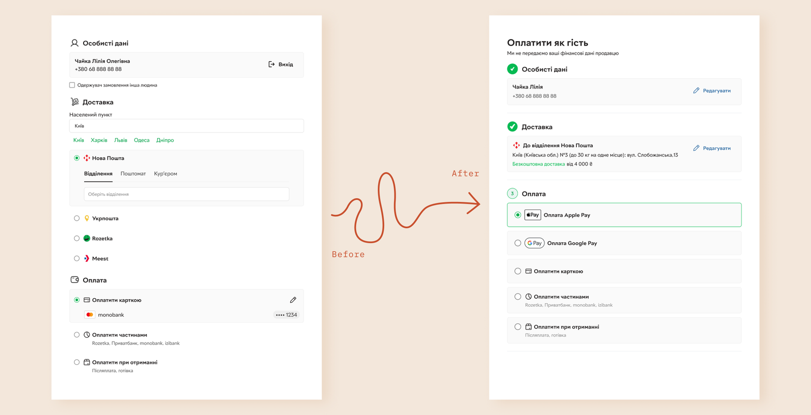
The decision: Designing guest checkout meant deciding what a first-time buyer sees with no saved data behind them — so I broke the flow into steps that reveal progressively — entering personal details, with the option to log in or create a new account, then delivery, then payment — instead of surfacing everything on one screen at once.
Why: Starting work on guest checkout led me back to a finding from a colleague’s audit of the main checkout — a Hick’s Law violation. The checkout logic itself was well structured — the real problem was broken hierarchy. There was no progressive disclosure, no step-by-step guidance through the process. The audit’s own recommendation — build the flow around progressive disclosure, with visible status per step, to lower cognitive load — is exactly the direction I took for guest checkout.
Rethinking saved delivery addresses
Trust also means giving users control over their data.
The decision: While working on the project, we noticed a problem that wasn’t actually specific to guest checkout — it sits in the main, authorized checkout too. Switching between logistics operators silently wipes saved delivery data, for any user. I tried a new approach to managing delivery addresses.
Why: Desk research and the competitor pattern analysis reinforced why this mattered: every payment service we looked at let users manage their own saved addresses and cards — switch between them, add new ones, remove old ones. RozetkaPay didn’t. Making that management visible and accessible, with the ability to switch between delivery addresses and add new ones, wasn’t an extra — it was table stakes we were missing.
The usability audit had already identified this issue in the main checkout. Usability testing didn’t reveal any new problems in this scenario, but interviews surfaced important additional insights: respondents described past orders that had been shipped to the wrong address because they hadn’t checked the default address. They also independently mentioned the need for a map to choose a delivery point instead of searching by address. Progressive disclosure (decision #2) partially addresses this issue: the buyer goes through the checkout step by step, giving them more opportunities to review their details instead of quickly scrolling past everything on one screen.
Conclusion
This project reminded me that trust isn’t something you can add with better visuals or stronger branding. Even though Rozetka is one of the most trusted brands in Ukraine, users still questioned the checkout the moment they were asked for personal information in an unfamiliar context. Trust has to be earned through the interaction itself.
The most valuable lesson for me was seeing how often the “obvious” problem isn’t the real one. We started by looking at authorization, but research revealed that the experience was influenced by several connected factors: understanding what RozetkaPay is, the amount of information shown at once, and the lack of control over personal data. Fixing only the phone number OTP confirmation — the exact point where the most users dropped off — wouldn’t have fixed the experience around it.
This project also reinforced how much I enjoy research-driven design. Instead of jumping into wireframes, I had the opportunity to work from interviews, audits, usability testing, and competitor insights, then translate those findings into product decisions.
Looking back, the biggest takeaway for me is that reducing friction isn’t always about removing steps. Sometimes it’s about giving users more control, explaining what’s happening, and making each next step feel predictable and safe.
Portfolio