Educational case study / Entertainment / UX
Dramox: Helping people find a play — and hear back when they can’t
Turning research into a clearer discovery experience — and a feedback loop for continuous learning.
Context
Dramox is an online theatre platform with a catalogue of 550+ Ukrainian, Czech, and international plays, live in Europe since 2020 and in Ukraine since 2022. Dramox isn’t trying to replace a night at the theatre; it’s trying to make theatre reachable for people who can’t get one — or who want to return to the same play again and again to relive the catharsis.
Internally, the team described how the product felt as a “library” — static, text-heavy, hard to move through. The goal for this project was to bring it closer to “live theatre”: more dynamic, easier to navigate, easier to trust.
- Role
- UX/UI Designer
- Skills
- Usability Audit, Competitor Analysis, User Interviews, Information Architecture, Wireframing, Survey Design
Problem
Dramox has 550+ plays, but users often struggle to find what they want to watch. The problem isn't the content itself — it's discovery: the path to the right play isn't obvious. And because the product doesn't collect enough user feedback — no ratings, sentiment tracking, or signal at cancellation — the team can't clearly understand why users leave and can only make assumptions.
Goal
Improve the discovery experience so users can find relevant plays more easily, while creating feedback points that help the team better understand user needs and reasons for churn.
Approach
How the problem was solved
Research was a shared team effort: a usability audit, competitor pattern analysis, and user interviews. The audit mapped and prioritized friction across the product; competitor research helped identify proven discovery patterns; interviews revealed how people actually search for and choose what to watch.
The research showed that the challenge wasn’t a lack of content or connections between it — Dramox already had a rich content network, but the product didn’t always make the most natural discovery paths obvious.
Key insights:
- People don’t always start with a play — interviews showed that users often come to search with a specific person in mind — an actor they like, a director they follow, or a playwright whose work they want to explore. Dramox already supported searching by name, but the results were too narrow: they didn’t show how that person was connected to other entities across the platform.
- The theatre was an important entry point — new and potential users often approached through a theatre first, then browsed its repertoire. Users also showed interest in finding theatres by city and tended to have loyalty to specific venues, yet the listing page felt static and cluttered with low-value sections, and the detail page lacked some of the visual context users expected from a real venue.
- The product had no user feedback loop — no rating, sentiment tracking, or cancellation feedback. When users couldn’t find what they wanted or decided to leave, the product had little direct insight into what had gone wrong.
Research and ideation were a shared effort across the team. My focus was on making discovery more intuitive and giving Dramox new ways to learn from its users — designing and owning the execution of search, the theatre page, and the feedback loop.
Search that understands intent
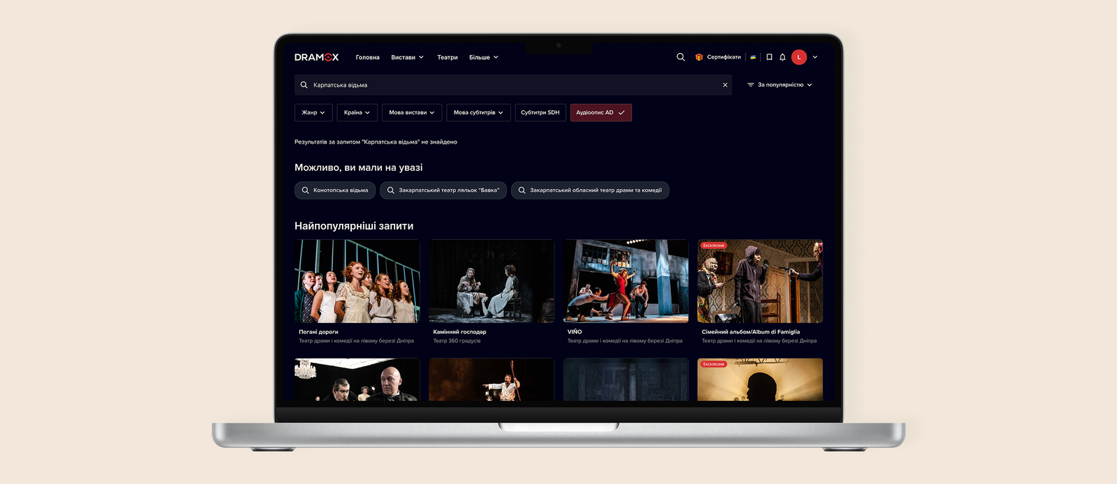
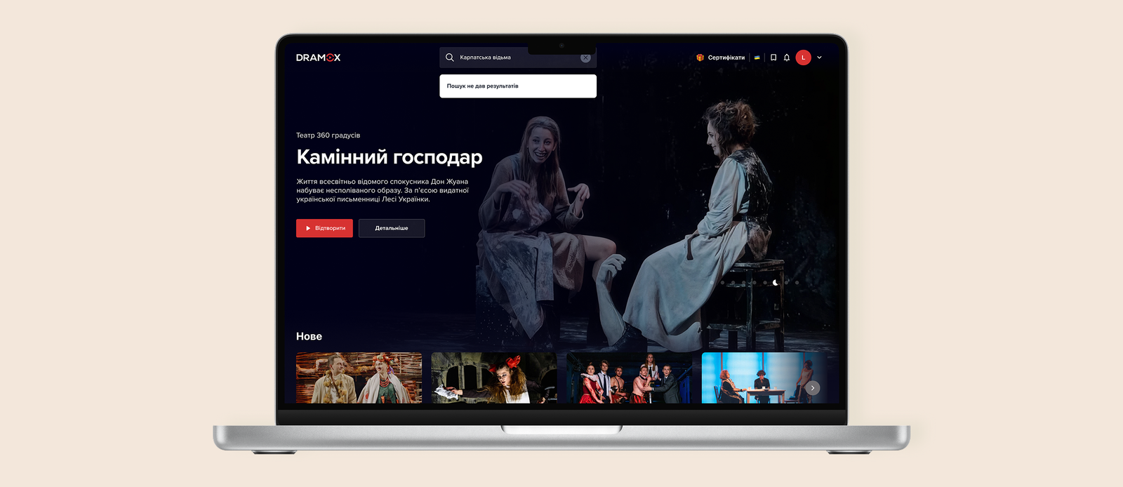
The decision: I redesigned search around three content types — plays, people, and theatres — with visual results instead of plain text. Popular plays appear as suggestions before the user starts typing. Each result also opens up the next layer of discovery: a play surfaces its cast and theatre, a person leads to their related plays and theatres, and a theatre leads to its repertoire and people.
Why: interviews showed that users don’t always start their search with a specific play. Many look for something to watch through an actor, director, or playwright they already know. However, Dramox’s search didn’t provide enough context around these people, and these different entry points into the content weren’t equally visible. The existing search could find plays, people, and theatres by name, but the results were presented as a flat list of text — users had to know what to search for and then discover the connections themselves. The goal wasn’t to create new connections, but to make the existing content network easier to navigate from any starting point — so searching for a person, theatre, or play could naturally lead to related content.
Helping users explore theatres
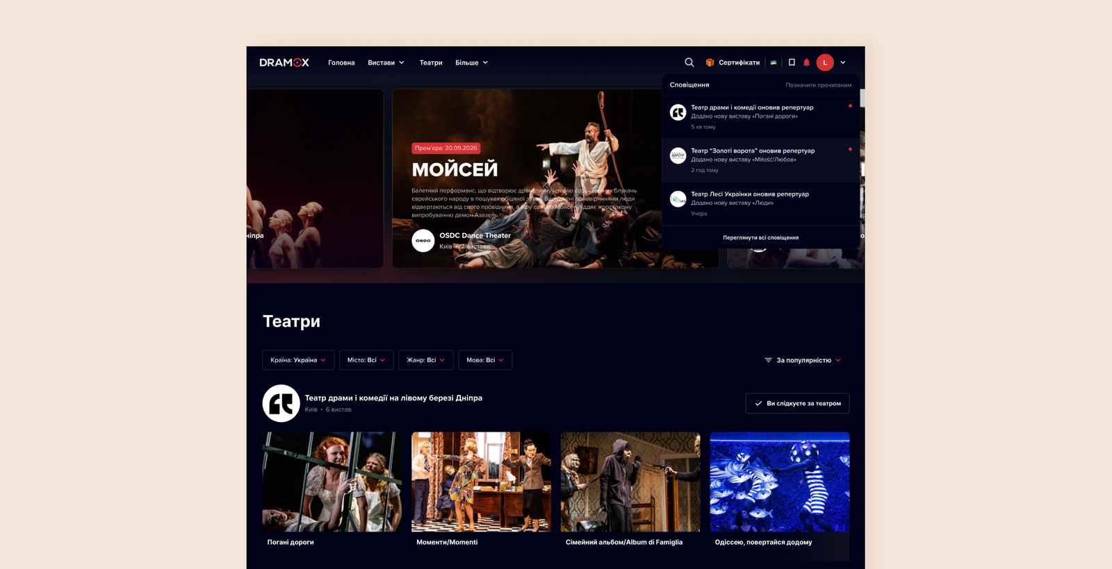
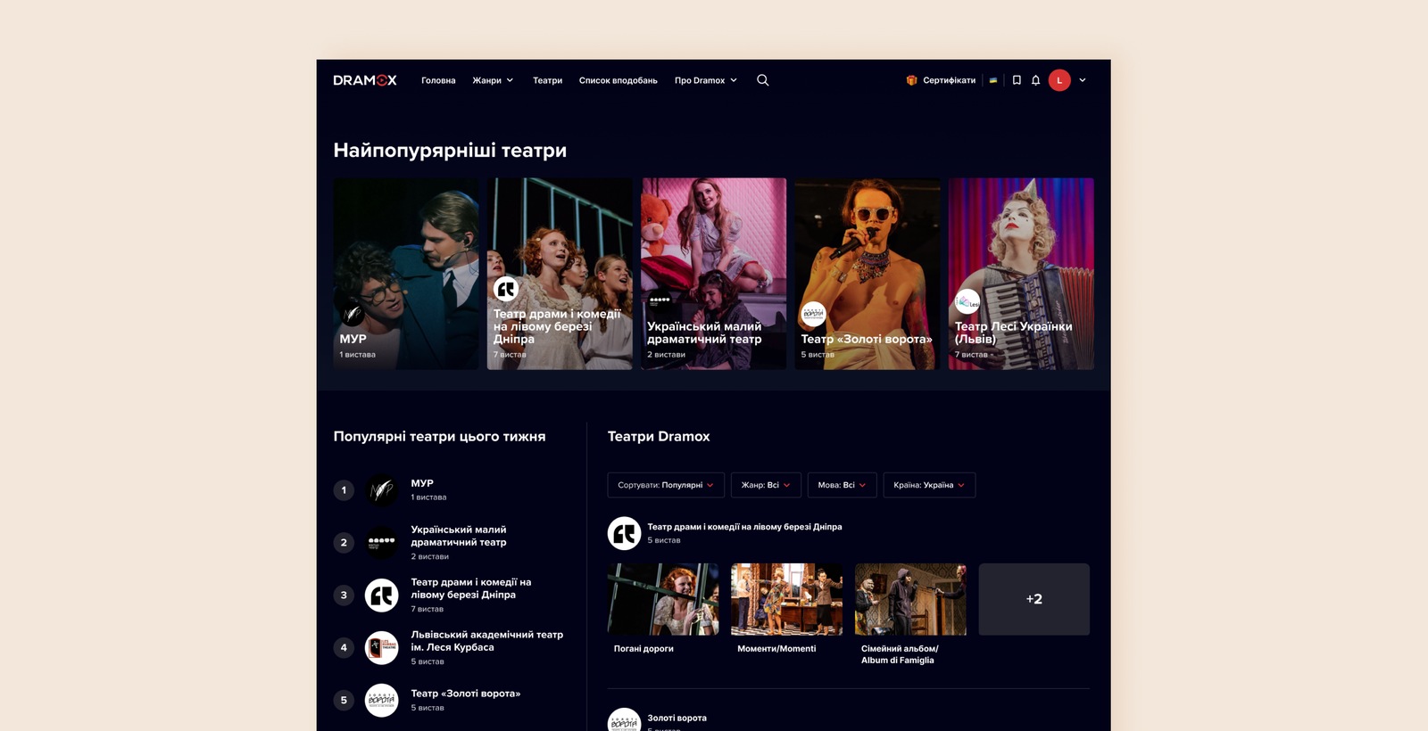
The decision: I simplified the theatre listing page by removing low-value sections, and used the hero area to promote new plays instead. I also made targeted improvements to the theatre detail page, including adding a photo of the venue.
Why: interviews showed that users often have a strong connection to specific theatres and wanted to see more context about the venue itself. The listing page also carried “Theatre of the Week” and “Most Popular Theatres” — two static sections that competed with the actual repertoire for attention, so we shifted the focus to theatres, their repertoire, and new content.
A feedback loop for continuous learning
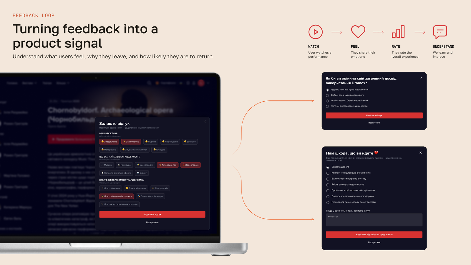
The decision: introduced three feedback touchpoints the product never had — an emotional-tags rating shown after a user finishes a play, an NPS check-in once someone has had enough time on the platform to have a real opinion, and an exit-intent survey triggered at cancellation.
Why: there was no rating system, no sentiment tracking, and no signal at cancellation. These were three silent gaps in the product. Without feedback, the team had no way to understand whether the discovery experience was actually improving. The product was flying blind on why people stayed, rated a play highly, or left.
- Emotional tags can eventually power mood-based discovery — a hypothesis user interviews confirmed, since people described plays by mood and feeling far more readily than by genre.
- NPS gives a running sentiment read.
- The exit survey turns cancellation into an actionable research moment instead of a dead end.
Outcome
No post-launch metrics were available at the time of this case study. Qualitatively, the redesign changed what the product could do: users could start discovery from a person, a theatre, or a play — not only from a play title; search results exposed related content instead of ending at a single, isolated match; the product gained three feedback signals it never had before; and cancellation became a research touchpoint instead of a silent drop-off.
Conclusion
This project changed how I think about discovery. A large catalogue doesn’t automatically create a good browsing experience — what matters is whether people can enter it from the way they naturally think about what they want to watch.
For me, the most valuable part was connecting discovery with feedback. Designing search and navigation solves today’s friction; ratings, NPS, and cancellation feedback create a way to keep learning from it. Instead of treating the redesign as a finished solution, we were giving the product a way to understand what to improve next.