UI Design · Automotive · Social
Snobar — designing a social network for car owners
Designing a mobile-first social experience for car owners and enthusiasts — connecting community, content, and car profiles into one product.
Context
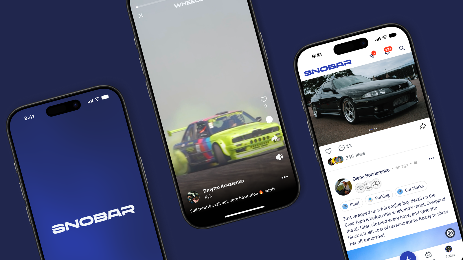
Snobar is a social network for car owners and enthusiasts, built for the Saudi market. The product combines familiar social features — a feed, short-form video, and Q&A — with a dedicated garage where users can create and manage profiles for the cars they own.
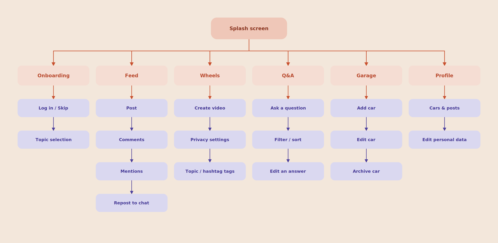
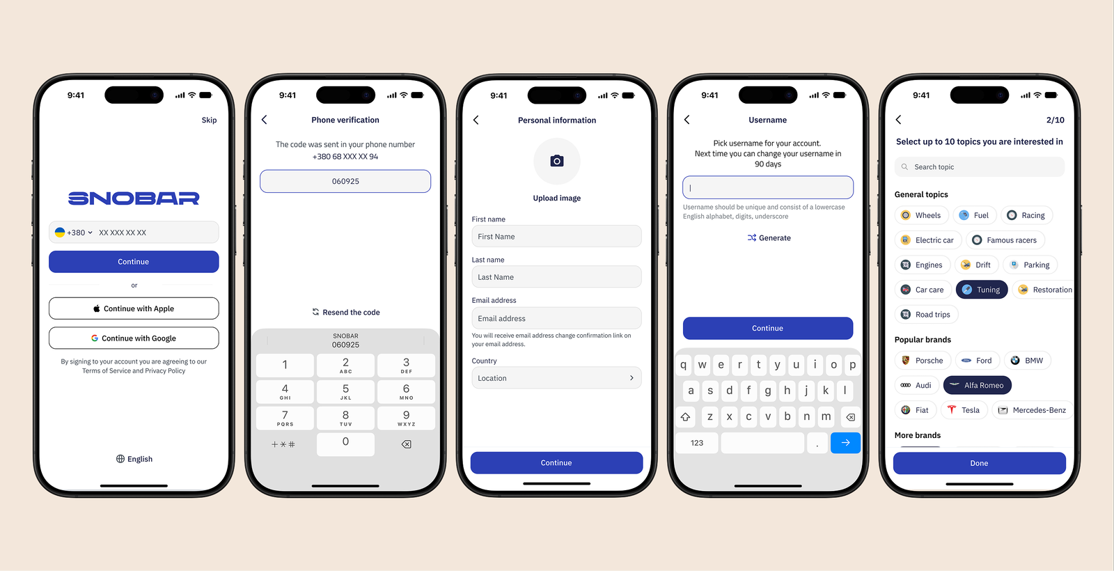
Unlike a typical social network, the car is a central part of the experience — content, profiles, and community interactions all connect back to a user's car. As UI Designer, I designed the interface end to end — from onboarding through the feed, Wheels, and Q&A, to the garage and profile — translating the product concept into a consistent visual system across every screen.
- Role
- UI Designer
- Timeline
- 2023
- Platform
- iOS / Android
- Scope
- Community · Garage · Social · UI
Problem
The product needed to bring several different experiences together — social content, short-form video, Q&A, user profiles, and car management — while keeping the experience simple and familiar for mobile users, and making the car itself feel like an integral part of the product.
Goal
Give the product concept a clear, consistent mobile UI across community, content, and garage flows — with the car profile visually connecting the different parts of the product.
Approach
How the problem was solved
I designed the UI across the product's core screens — onboarding, feed, Wheels, Q&A, garage, and profile — building a shared visual system as I went.
With the core screens in place, I built out the UI kit for the product, along with all the visual assets needed for the App Store and Google Play listings.
Community
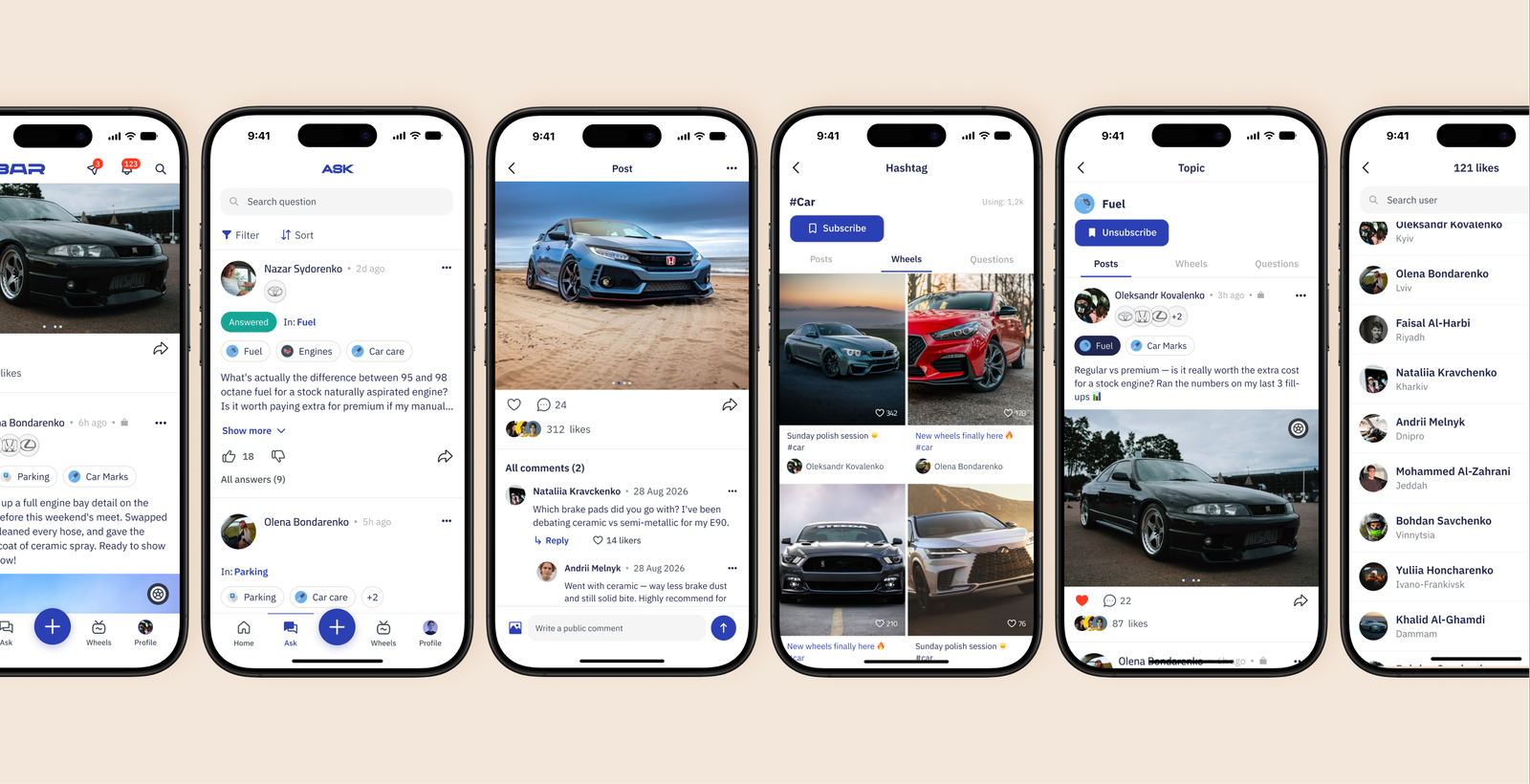
The community layer brings together three content experiences: the feed, short-form video, and Q&A.
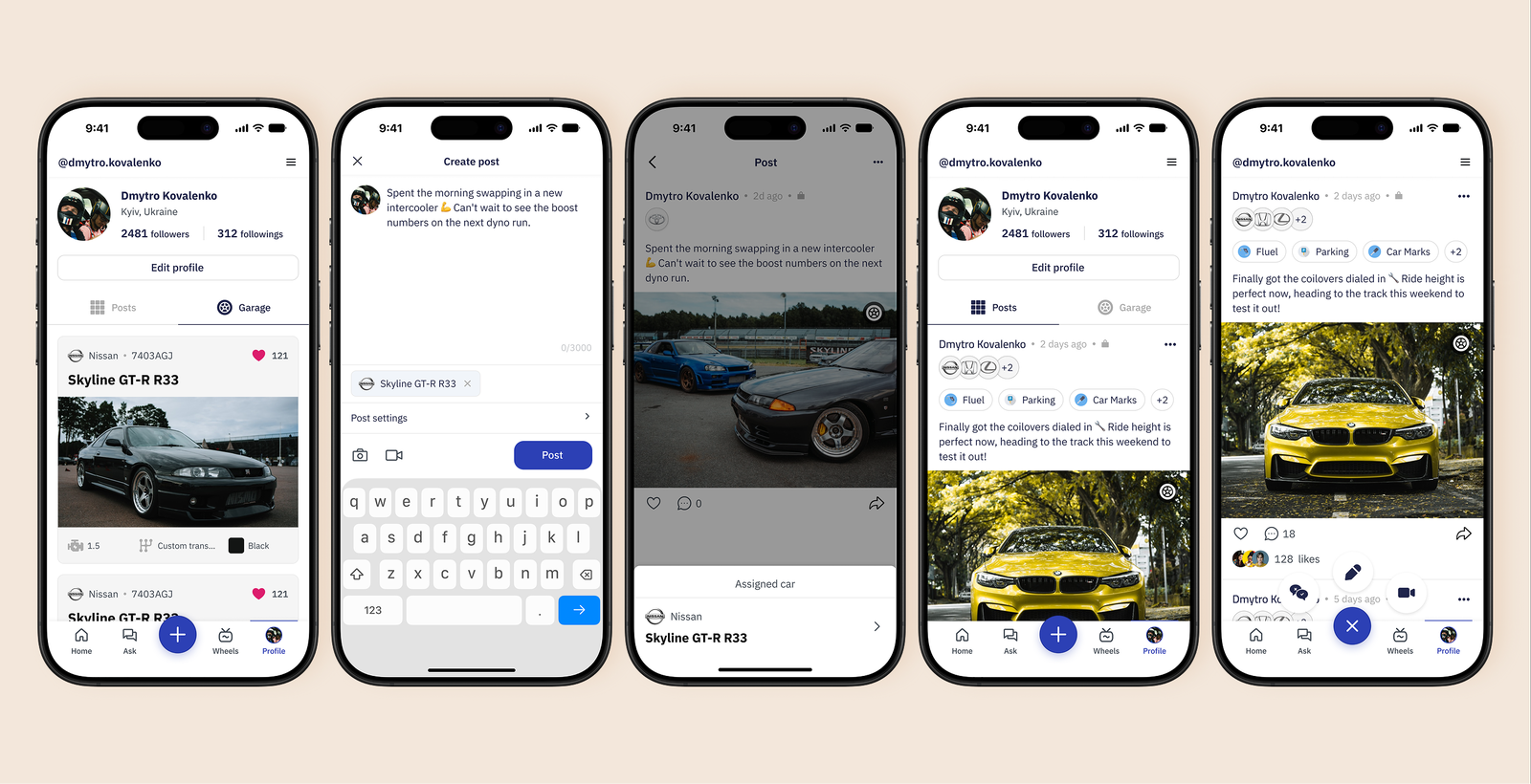
Garage
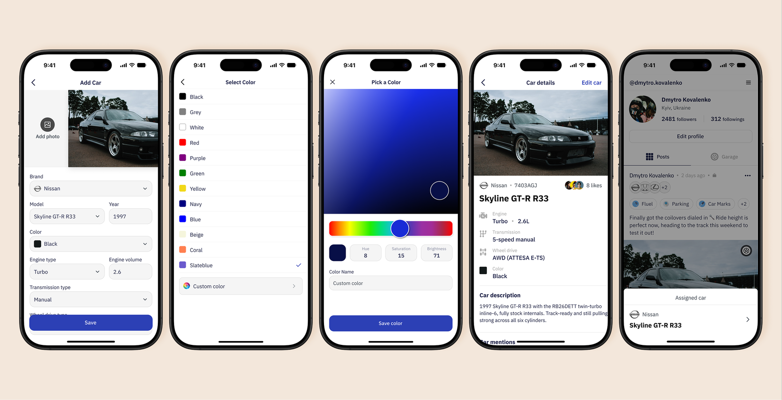
The Garage makes the car a persistent part of the user's profile rather than just an attribute of a post.
Conclusion
Snobar is one of the projects that taught me the most about holding a single visual language together across real complexity — a feed, short-form video, a Q&A hub, and structured car profiles that could each have easily pulled the UI in a different direction.
For me, that's where the craft actually sits — not in how polished any one screen looks, but in staying consistent across dozens of screens and edge cases, all the way down to the icon set and the assets that ship to the App Store and Google Play.